pacman::p_load(tidyverse)In-Class1
Loading Tidyverse
Importing data
exam_data <- read_csv("data/Exam_data.csv")Working with theme
Changing the colors of plot panel background of theme_minimal() to light blue and the color of grid lines to white.
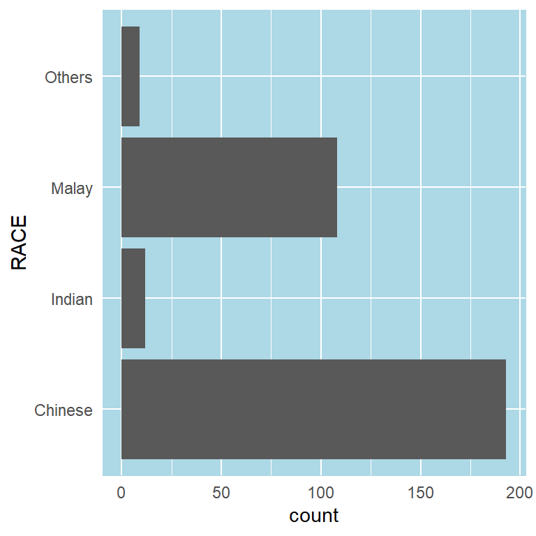
ggplot(data=exam_data, aes(x=RACE)) +
  geom_bar() +
  coord_flip() +
  theme_minimal() +
  theme(
    panel.background = element_rect(fill = "lightblue", colour = "lightblue",
                                    size = 0.5, linetype = "solid"),
    panel.grid.major = element_line(size = 0.5, linetype = 'solid', colour = "white"),
    panel.grid.minor = element_line(size = 0.25, linetype = 'solid', colour = "white"))
Designing Data-drive Graphics for Analysis I
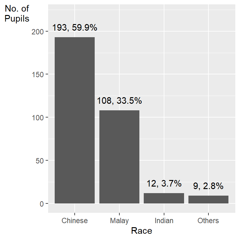
ggplot(data=exam_data,
       aes(x=reorder(RACE,RACE,
                     function(x)-length(x)))) +
  geom_bar() +
  ylim(0,220) +
  geom_text(stat="count",
      aes(label=paste0(..count.., ", ",
      round(..count../sum(..count..)*100, 1), "%")),
      vjust=-1) +
  xlab("Race") +
  ylab("No. of\nPupils") +
  theme(axis.title.y=element_text(angle = 0))
This code chunk uses fct_infreq() of forcats package.

exam_data %>%
  mutate(RACE = fct_infreq(RACE)) %>%
  ggplot(aes(x = RACE)) +
  geom_bar()+
  ylim(0,220) +
  geom_text(stat="count",
      aes(label=paste0(after_stat(count), ", ",
      round(after_stat(count)/sum(after_stat(count))*100,
            1), "%")),
      vjust=-1) +
  xlab("Race") +
  ylab("No. of\nPupils") +
  theme(axis.title.y=element_text(angle = 0))
Designing Data-drive Graphics for Analysis II
- Adding mean and median lines on the histogram plot.
- Change fill color and line color
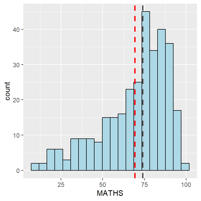
ggplot(data=exam_data,
       aes(x= MATHS)) +
  geom_histogram(bins=20,
                 color="black",
                 fill="light blue") +
  geom_vline(aes(xintercept=mean(MATHS, na.rm=T)),
             color="red",
             linetype="dashed",
             size=1) +
  geom_vline(aes(xintercept=median(MATHS, na.rm=T)),
             color="grey30",
             linetype="dashed",
             size=1)
Designing Data-drive Graphics for Analysis III
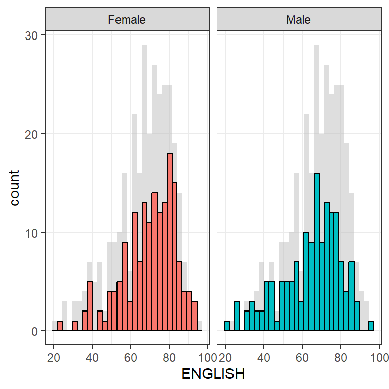
ggplot(d, aes(x = ENGLISH, fill = GENDER)) +
  geom_histogram(data = d_bg, fill = "grey", alpha = .5) +
  geom_histogram(colour = "black") +
  facet_wrap(~ GENDER) +
  guides(fill = 'none') +
  theme_bw()
Designing Data-drive Graphics for Analysis IV
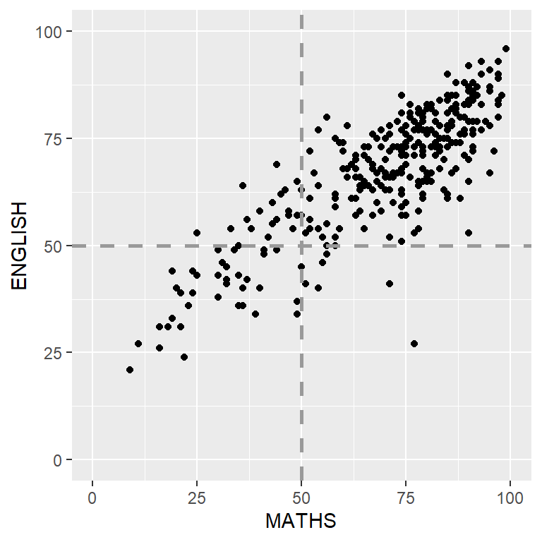
ggplot(data=exam_data,
       aes(x=MATHS, y=ENGLISH)) +
  geom_point() +
  coord_cartesian(xlim=c(0,100),
                  ylim=c(0,100)) +
  geom_hline(yintercept=50,
             linetype="dashed",
             color="grey60",
             size=1) +
  geom_vline(xintercept=50,
             linetype="dashed",
             color="grey60",
             size=1)
Tableau
Links to Tableau Visualisations: